
The Intriguing Observations series was created to gather some of the greatest supporters and bloggers to provide their own insight on all things creative both in their ventures and their techniques. This week on the guest series is another all-star supporter and an outstanding wordsmith Samantha Hunter.
Learning to sew and decorating a home has taught me a lot about using color. It was inevitable that this would find its way into my writing. When I learned to quilt, I had to learn a lot about color combinations, tones and patterns. In painting (and repainting) the rooms in our house I’ve learned a lot about using color as well. For instance, how to use color with certain kinds of light, how colors will make a room seem larger or smaller, welcoming or not, and how to create a flow of color from one room to the next. In sewing, you can make a subtle color pop in a quilt by placing it next to something that contrasts, and the difference between striking and gaudy is usually the placement of colors next to each other.
As we all know, color affects mood – green and blue are soothing, orange can stimulate appetite, and yellow can inspire happiness. Brown is earthy, white is cold. Color also has historic can cultural meaning – the main rooms in my home are painted to reflect earthy, Craftsman color palettes popular in the early 1900s. Or, if you like red, you know in the US red usually suggests “danger” while in China it’s the color of wedding dresses for good luck! (White, in China, symbolizes death).
Some colors work together and some do not. It’s best whenever you are using color to use tones and shades that complement and work together somehow. Here are some good links to read up on using color:
http://www.hgtv.com/decorating/how-to-choose-a-color-scheme/index.html
http://www.smashingmagazine.com/2010/02/08/color-theory-for-designer-part-3-creating-your-own-color-palettes/
You can do a lot with color and get as deeply into it as you would like in your book, but a consistent or interesting color scheme for your book can enhance your story, as well as tell us something about the characters, scenes and moods, which in turn affect the reader’s emotions and responses.
Does your heroine wear a red coat or a blue one? Why? What does this all say about her? If you describe them as living in an old farmhouse, or a log cabin, or an adobe ranch, you want to have a color palette that’s amenable to those living spaces as well as addressing your character’s choices. If you are decorating your character’s apartment, and she is a historian, what period of history does she favor and how would that be reflected in her dress or room colors? Or, if she really has a hidden desire or hates her job as a historian, maybe it shows up in the colors she chooses for her personal space in contrast to her office.
One of my favorite things to do with color is to use it to show how the characters and the story are also changing. For instance, in one of my earlier books, Fascination, my heroine wears only black and white at the start of the story – this reflects the issues at that point in the book, being trapped in extremes. But by the end, she is wearing multi-colored, flowered dresses – her world has opened up; she’s free. Even this simple use of color can have a subtle effect on the reader and how readers perceive the story.
Another example might be in the weather, the colors in the environment that you show through the protagonist’s POV and how that changes depending on their situation or mood. Or, how it can change in the moment when someone caged by beige walls suddenly sees them as the frame for a beautiful view of the blue sky out the window – this could represent a life-changing moment for a character, a change in their perception of their world.
You can go back through scenes and consider how color makes a difference – or how it could make a difference. How does the gold wall look in different lighting, and how does that convey a certain mood? Consider everything from the color of the walls and clothing for your characters to the color of their car, etc. You can send messages to the reader through this use of conscious color choice, and make your story deeper in a very easy, fun way.
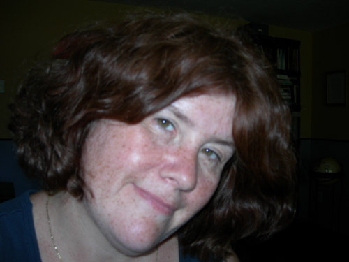
 Sam Hunter lives in Syracuse New York with her husband and several pets. Since January 2004 when she sold her first book to Harlequin Blaze, Virtually Perfect, she has gone on to publish several more with new releases on the way. Sam holds two Master's degrees and was a university instructor for many years before quitting to live the writing life, is a confirmed TV addict and enjoys gardening, sewing, and travel.
Website: www.samanthahunter.com
Twitter: Follow @SamanthaHunter
Current books: Harlequin Blaze, Straight to the Heart; Indie Mystery: Once Burned, Book Two in the Sophie Turner Mystery series.
Learning to sew and decorating a home has taught me a lot about using color. It was inevitable that this would find its way into my writing. When I learned to quilt, I had to learn a lot about color combinations, tones and patterns. In painting (and repainting) the rooms in our house I’ve learned a lot about using color as well. For instance, how to use color with certain kinds of light, how colors will make a room seem larger or smaller, welcoming or not, and how to create a flow of color from one room to the next. In sewing, you can make a subtle color pop in a quilt by placing it next to something that contrasts, and the difference between striking and gaudy is usually the placement of colors next to each other.
 |
| Photo Credit |
Some colors work together and some do not. It’s best whenever you are using color to use tones and shades that complement and work together somehow. Here are some good links to read up on using color:
http://www.hgtv.com/decorating/how-to-choose-a-color-scheme/index.html
http://www.smashingmagazine.com/2010/02/08/color-theory-for-designer-part-3-creating-your-own-color-palettes/
You can do a lot with color and get as deeply into it as you would like in your book, but a consistent or interesting color scheme for your book can enhance your story, as well as tell us something about the characters, scenes and moods, which in turn affect the reader’s emotions and responses.
Does your heroine wear a red coat or a blue one? Why? What does this all say about her? If you describe them as living in an old farmhouse, or a log cabin, or an adobe ranch, you want to have a color palette that’s amenable to those living spaces as well as addressing your character’s choices. If you are decorating your character’s apartment, and she is a historian, what period of history does she favor and how would that be reflected in her dress or room colors? Or, if she really has a hidden desire or hates her job as a historian, maybe it shows up in the colors she chooses for her personal space in contrast to her office.
One of my favorite things to do with color is to use it to show how the characters and the story are also changing. For instance, in one of my earlier books, Fascination, my heroine wears only black and white at the start of the story – this reflects the issues at that point in the book, being trapped in extremes. But by the end, she is wearing multi-colored, flowered dresses – her world has opened up; she’s free. Even this simple use of color can have a subtle effect on the reader and how readers perceive the story.
Another example might be in the weather, the colors in the environment that you show through the protagonist’s POV and how that changes depending on their situation or mood. Or, how it can change in the moment when someone caged by beige walls suddenly sees them as the frame for a beautiful view of the blue sky out the window – this could represent a life-changing moment for a character, a change in their perception of their world.
You can go back through scenes and consider how color makes a difference – or how it could make a difference. How does the gold wall look in different lighting, and how does that convey a certain mood? Consider everything from the color of the walls and clothing for your characters to the color of their car, etc. You can send messages to the reader through this use of conscious color choice, and make your story deeper in a very easy, fun way.
Website: www.samanthahunter.com
Twitter: Follow @SamanthaHunter
Current books: Harlequin Blaze, Straight to the Heart; Indie Mystery: Once Burned, Book Two in the Sophie Turner Mystery series.


 Posts
Posts

